Tag Archives: bullish-bearish

The VIX: What It Is, What It Isn’t, What To Do About It Now

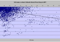
Summary Widely regarded as the “fear factor” forecaster of stock market price declines, it has an irregular, unreliable pattern of prophecy. Perversely, it is a much more reliable forecaster of general market index recovery. What should we believe it is telling now? How best to profit from its ODDS and PAYOFFS of prior outcomes? Where the VIX comes from The basic equation of stock option valuation contains several interrelated factors, including the underlying stock’s price, which when solved provides an appropriate price for each of the several available strike-price and expiration-dated option contracts. One of the key input factors common to all the contract price solutions is the issue of uncertainty present for the underlying stock’s future price. From the start of trading in listed stock options over 40 years ago, options traders turned the contract pricing formula around and accepted the market’s options trading prices as inputs, in place of the uncertainty component of the equation, and solved for the stock’s “implied volatility.” Traders discovered that the degree of “implied vol” for each stock tended to have a usual level of uncertainty across time, and being aware of current variances from its norm, provided them with profitable trading insights into future prices. By applying this approach to options on a market index, the Chicago Board Options Exchange [CBOE] in 1983 devised and copyrighted the term VIX to designate an index measure of the S&P 500’s implied volatility. The VIX Index is quoted in percentage points and represents roughly the (thus derived) expectations of potential change of the S&P 500 in the next 30 days. Direction of change is not indicated. If it’s a Fear Index, why does that matter? That should be obvious, but let’s test it out. We go to a reliable, available source for data, like Yahoo Finance, and obtain all the available daily data history for the VIX Index (since 1/2/1990) and for something appropriate that we can easily trade, like the SPDR S&P 500 Fund ETF (NYSEARCA: SPY ). It is available from 1/29/1993, downloaded in .csv (comma separated values) for easy use in a spreadsheet tool like Excel. There are well over 5,000 days of data to use, over ten years worth, plenty to offer statistically reliable inferences. Matching up the dates from the two data sets, we calculate what has been the worst possible price change for SPY in the coming 3 months after each day, and compare that with the VIX Index value at the initial date. Figure 1 shows what we get. Figure 1 (click to enlarge) The VIX Index in these 11 years never got much below 10, and days measuring above 30 start to get sparse. Much of the time between its 10 to 15 value looks to be completely random. There the worst next-3-month market declines are concentrated around -5% to -7%. Days with VIX above 15 start to see a shower of more substantial declines, plus a lot of the less than -5% kind. The best-fit line confirms the general relationship of higher index numbers with larger market declines. But the far fewer large outliers seem to dictate the fit relationship, compared to scads of close-in, small-scale comparisons. Just to be fair, let’s look at the other side of the coin: What were the market’s best days in the next 3 months, compared to the “fear-factor” advance warning? Check out Figure 2. Figure 2 (click to enlarge) This looks strangely like a mirror of Figure 1’s market moves to the downside, hinged along the zero% change line. Now the relationship line shows increasing market price gains as the VIX Index is higher. Where the index is small, the level of determination is small to any degree of specificity. Figure 2’s contrast with Figure 1 demands some more inclusive measure of the usefulness of the VIX as a forecaster of coming market behavior. In Figure 3, we attempt this by relating the index levels to a fixed holding period price change in SPY. Our first effort, using 3 months as a test period does not provide any motivation to believe that a longer or shorter holding would create much difference. Figure 3 (click to enlarge) VIX Index values over a long period of observations have proven by themselves to be a truly rotten forecaster of likely subsequent market price changes, either to the downside, the upside, or simply on average. Figure 3 has a relationship line basically independent, one of the other. One encouraging thing about this is that the presence of the VIX Index may have helped keep the market balanced, as evidenced by there being no sign of a pattern of advantage created by the presence of this sophisticated analytical measure. Its early benefits, if any, were quickly arbitraged away by astute observers. Inherent in the nature of the VIX Index’s creation is that it tries to define uncertainty, rather than differences of value from some norm or standard. The statistics involved can identify levels of uncertainty, but lack any useful directional sense in their derivation. When the game changed In early 2006, options on the VIX Index (VIX) itself were listed by the CBOE and began trading on a daily basis. That permitted us to show what the market’s own actions have as a forecast of this presumed market forecaster. But now dimensions of price change direction now are being shown, when the means of making such forecasts are known, as we do using behavioral analysis principles. What are today’s directional indications for the VIX? Figure 4 presents this past Friday’s closing-prices-based forecast for the VIX Index in its most right-hand vertical bar. It represents a range of that index’s potential market quotes in coming days, weeks, and few months. Figure 4 (used with permission) Readers of our Intelligent Behavior Analysis articles on Seeking Alpha are familiar with the measure we use to identify likely directional emphasis resulting from the analysis. We term our measure the Range Index [RI], calculated from the price range being forecast by the analysis of the investment subject. It indicates what proportion of the whole range lay downward from the current price. In Figure 4, the RI of the VIX is 7. That means 93% of the forecast range is to the upside, a typically strong condition. With a current market quote of $14.30 for the VIX and an upside limit to the range of $18.82, a rise in price by +31.6% is viewed as likely enough to be possible that parties becoming at risk to changes in its price are willing to pay for protection against the change, should it happen. The possibility of a complementary price decline works out to a -2.5% change. At these extremes, there is about a 13-to-1 prospect of advantage on the “reward” side over the “risk” exposure (of a bet on the VIX). We have devised a simple, but powerful, investment portfolio management discipline that functions very effectively using this kind of information. We use it as a standard of behavior to compare the investment desirability of virtually all of the roughly 3,500 equity securities examined daily. Applied to the VIX, its results appear in the row of data between the two blue-background pictures of Figure 4. The results are that in the 124 prior instances of the 1,261 market days in the last 5 years where a 7 RI of the VIX occurred, 76% of them were profitable experiences. The net gains in all 124 earned +24% gains in average holding periods of 36 market days, which would have produced an average annual rate of return of +355%. If the VIX were a security that could be bought and sold, most likely this would be a good point in time and price to buy it. But the VIX is an index that cannot be bought or sold as a security. There are, however, ETFs that are based on movements of the VIX Index that can be traded conventionally. Ready to get confused? This is where two logical inversions take hold of the task of making money from what can be known about the VIX, its dependent ETFs, and the market as evidenced by the S&P 500 Index, or SPY. The first inversion comes from investors’ normal association with being “long” in assets that rise sympathetically when the “market” goes up. The “price” of the VIX is a measure that rises when the market unexpectedly goes down, reflecting increasing investor uncertainty. And uncertainty is what the VIX measures. So, when market prices go down, VIX Index goes up. The second inversion comes from investors’ usual attempts to find forecasting tools that will anticipate market moves, allowing them to position themselves to be drawn along by or accentuated by the market’s investing gravity. As we showed in our prior article about the VIX, the sequence is reversed here. It is the market’s actions that forecast subsequent VIX-related price moves, not the other way around. Then there is simply a complexity in that the ETFs related to the VIX are most directly denominated not by the VIX Index itself, but by the prices of futures contracts on the index. While there are logical parallels, each security has its own markets, with frequent individual local influences that may obfuscate otherwise reasonable expectations. Arbitrage here is not a game for the casual practitioner or the dilettante. The array of ETPs at hand includes: iPath S&P 500 VIX Short-Term Futures ETN (NYSEARCA: VXX ) ProShares VIX Short-Term Futures ETF (NYSEARCA: VIXY ) ProShares VIX Mid-Term Futures ETF (NYSEARCA: VIXM ) VelocityShares VIX Short-Term ETN (NASDAQ: VIIX ) ProShares Ultra VIX Short-Term Futures ETF (NYSEARCA: UVXY ) ProShares Short VIX Short-Term Futures ETF (NYSEARCA: SVXY ) Their MM forecasts and forecast history details are in Figure 5. Figure 5 (click to enlarge) Remember please that the orientation of this data is from having or taking a long position in the designated security. All except SVXY are expected to go up in price when the S&P 500 goes down meaningfully. SVXY, being a security that is short its VIX futures holdings, should rise when the VIX futures go down. Further, all of the historical data (in columns 6 and 8-15) is from the standard portfolio management discipline applied to prior appearances of forecasts with upside to downside balances like today’s, as indicated in column (7). Tomorrow or a week from now, these balances are likely to be different, and if so, decisions at that time need fresh historical backgrounds. But at this point, the attractiveness of a long-position bet in each is ranked by the figure of merit in column (15). It attempts to blend odds of profitability with win-loss ratios and frequency of prior opportunities specific to each issue under conditions like the present. Conclusion On this basis, the VIX Index itself is the best bet, but one not directly placeable. Certainly, the efforts of Greeks and the EU keep the VIX uncertainty pot boiling. The implication is that the S&P 500 Index is likely to encounter a decline in the next 3 months, significant enough to pop the VIX from 14+ to near 19. But the cost of making that bet through VIX futures is already priced high enough that the odds of making money at it are less than a coin-flip and as little as one in 8 or one in 12. The sole exception to such a dismal proposition is that over the course of the coming 3 months, the S&P is seen likely to rise sufficiently to generate a profit in SVXY from here in nearly 8 out of 10 tries. In the past, such propositions (43 market days out of the nearly 3 years of that ETF’s existence) have generated net gains of over 8% in less than 6 weeks of average position holding times for a +98% annual rate of gain. Now, that’s pretty attractive. But there is a possibly better strategy than just buying SVXY here. If the market pros who daily express their views about the near future of the S&P 500 via hedging in the index futures markets are right and the VIX odds say they are right 3 out of 4 times (76 out of 100), the SPX and the SPY are likely at that new lower point of the S&P 500 to be supporting an even better (lower) buying price on SVXY than it now has. Many variations of action implementation can be imagined. Disclosure: The author has no positions in any stocks mentioned, and no plans to initiate any positions within the next 72 hours. (More…) The author wrote this article themselves, and it expresses their own opinions. The author is not receiving compensation for it (other than from Seeking Alpha). The author has no business relationship with any company whose stock is mentioned in this article.

The Backtest Called Buy And Hold

A backtested strategy is one that looks at historical market behavior and cycles, creates a trading rule, and then repeats that rule in a disciplined quantitative way. Buy and Hold is a backtest. All backtested strategies have cycles. “The one size fits all approach of standardized testing is convenient but lazy.” – James Dyson In my travels around the country presenting to and meeting with hundreds of financial advisors and individual investors, I’ve been fortunate to really get a clearer understanding of how people in the business of portfolio management think. Those who have attended my various Chartered Financial Analyst (CFA) and Market Technicians Association (MTA) Chapter presentations on our award winning papers come out of the sessions with a deeper understanding of how Utilities and Treasuries can help with predicting stock market corrections and volatility. The presentation has evolved over the past six months, now hitting on topics related to behavioral finance, false positives, anomaly persistence, and discipline in sticking to an investment strategy beyond the small sample we all live in. Occasionally in my one on one meetings with advisors discussing our research I receive a degree of skepticism about the strategies outlined in those papers. Some simply do not believe in backtesting market behavior, whereby historical price movement is analyzed and a strategy is created to better position for that path of equity or bond returns. Whenever I encounter disbelief in backtested results, I end up asking that person if he or she believes in buy and hold instead of backtested strategies. The answer is always yes. The next question I then ask is a simple one – isn’t buy and hold itself a backtest? Think it through. A backtested strategy is one that looks at historical market behavior and cycles, creates a trading rule, and then repeats that rule in a disciplined quantitative way. The results either show a persistent anomaly exists which can be exploited (momentum, small-cap effect, mean reversion, etc), or the backtest fails. Buy and hold is nothing more than a backtest as well. It is a trading rule with one decision: buy. In addition, one can argue buy and hold is an anomaly throughout time as well given how persistently doing nothing seems to outperform the vast majority of traders and investors who act on noise and not signal. Every backtested strategy, and every anomaly of course has its own cycles. No strategy works all the time. Even in the 2014 Dow Award winning paper on Beta Rotation (click here ), we show that the backtest of a rotation around Utilities (NYSEARCA: XLU ) and the stock market (NYSEARCA: SPY ) underperforms the stock market going back to 1926 around 20% of the time on a rolling 3 year basis. The anomaly documented in that paper which is what we attempt to take advantage of in our alternative and equity mutual funds and separate accounts itself has cycles, just like buy and hold does. This leads us to today. As mentioned in my last week in review writing (click here ) I alluded to the idea that rates may finally rise and the yield curve could steepen, simply as a contrarian trade to an unrelenting trend. That indeed has happened. Our inflation rotation strategy nicely took advantage of the January Treasury strength and held on to it as buy and hold of Treasuries (NYSEARCA: TLT ) so far in 2015 has largely given back those gains. Our beta rotation strategy was among the few US equity approaches positive in January as everything else fell hard, and continues its lead. Why? Because the cycle of volatility and risk management appears to re-asserting itself. Our entire approach is built on proven leading indicators of exactly those types of environments over time. There are some very powerful trades that we believe we have the ability to take advantage of this year as the indicators that drive our models begin to reassert themselves in a normalizing environment. If indeed our cycle is about to return, then the buy and hold backtest will itself have its own period of weakness. The timing of this makes some sense given the likelihood of the Fed raising rates this year. Perhaps the complete love of passive indexing which everyone seems to want now, but no one wanted in March 2009, is due to work less well. Diversification is nothing more than the process of combining low or uncorrelated backtests in a portfolio, attempting over time to smooth out returns and generate wealth. Some backtests in certain periods work better than others. That’s exactly why combining multiple strategies and asset classes in a portfolio over long periods of time tends to be superior to the trade of the moment. To that end, we are at the moment very excited for how intermarket relationships are now finally behaving. Disclosure: The author has no positions in any stocks mentioned, and no plans to initiate any positions within the next 72 hours. (More…) The author wrote this article themselves, and it expresses their own opinions. The author is not receiving compensation for it. The author has no business relationship with any company whose stock is mentioned in this article. Additional disclosure: This writing is for informational purposes only and does not constitute an offer to sell, a solicitation to buy, or a recommendation regarding any securities transaction, or as an offer to provide advisory or other services by Pension Partners, LLC in any jurisdiction in which such offer, solicitation, purchase or sale would be unlawful under the securities laws of such jurisdiction. The information contained in this writing should not be construed as financial or investment advice on any subject matter. Pension Partners, LLC expressly disclaims all liability in respect to actions taken based on any or all of the information on this writing.

Beware Of Convertible Bond Funds

Summary Convertible CEFs offer appealing distributions but their overall performance has not been great. Convertible CEFs have been more volatile than either high yields bonds or the general stock market. CHY has been the best performing CEF but it is now selling at a premium which reduces its attractiveness. As a retiree, I am continually looking for sources of high income but I also don’t want to court excessive risk. This search led me to consider Convertibles Closed End Funds (CEFs). I wrote an article about a year ago that reviewed the reward-versus-risk benefits of this asset class. This article updates the previous article to see how convertible funds have fared over the past year. However, before jumping into the analysis, I will recap some of the characteristics of convertible securities. A “convertible security” is an investment, usually a bond or preferred stock that can be converted into a company’s common stocks. A company will typically issue a convertible security to lower the cost of raising money. For example, many investors are willing to accept a lower payout because of the conversion feature. The conversion formula is fixed and specifies the conditions that will allow the holder to convert into common stock. Therefore the performance of a convertible is heavily influenced by the price action of the underlying stock. As the stock prices approaches or exceeds the “conversion price” the convertible tends to act more like an equity. If the stock price is far below the conversion price, the convertible acts more like a bond or preferred share. Convertible CEFs usually contain a mixture of convertible securities and high yield bonds. The attraction of convertible CEFs is that they offer upside potential with some protection on the downside. Granted that with a portfolio of high yield bonds and convertibles the downside protection is limited (as evidenced by severe losses in 2008). However, over the long run, the fund manager seeks to obtain the “sweet spot” between fixed income and equity that will enable him to outperform his peers. The funds that were analyzed in my previous article are summarized below. All these funds have histories that go back to at least 2007 but in this analysis, I concentrated on near term performance. I will touch on long term risk and rewards at the end of the article. AGIC Convertible and Income (NYSE: NCV ). This CEF sells for a premium of 6.4%, which is similar to the premium a year ago. Over a 3 year period, the premium has averaged 7.5%. The fund has a portfolio of 127 holdings, consisting of 57% convertible securities and 40% high yield bonds. The price of this fund dropped 57% in 2008 but rebounded an amazing 143% in 2009. The fund utilizes 31% leverage and has an expense ratio of 1.2%. The distribution is a high 12.1%, which is received from income with no return of capital (NYSE: ROC ) over the past year. Due to the high payout ratio, the fund tends to invest in lower quality securities that provide higher yield. AGIC Convertible and Income II (NYSE: NCZ ). This CEF sells for a high premium of 13.3%, which is the same as a year ago. Over a 3 year period, the fund sold at an average premium of 10.7%. The portfolio contains 126 holdings, consisting of 57% convertibles securities and 41% high yield bonds. This fund uses a similar investment strategy as its sister fund NCV. The price of this fund plummeted 61% in 2008 but rocketed 145% in 2009. The fund utilizes 31% leverage and has an expense ratio of 1.2%. The distribution is a high 12%, which is generated by income with no ROC over the past year. As with its sister fund, NCZ has migrated to lower quality securities to maintain the high distribution. Calamos Convertible and High Yield (NASDAQ: CHY ). This fund sells at premium of 4.6%, which is much different than a year ago when the fund sold at a discount of 6.3%. Over that past 3 years, the fund has sold at an average discount of 3.6%. The portfolio has 277 holding, consisting of 59% convertibles and 36% high yield bonds. About 15% of the holdings are investment grade. The price of this fund only dropped 27% in 2008 and it rebounded 51% in 2009. The fund uses 28% leverage and has an expense ratio of 1.5%. The distribution is 8.2%, which consists of mostly income with a small amount of ROC over the past year. The fund tends to focus on higher quality convertibles that are selling near the conversion price, making this fund more equity-like. Calamos Convertible Opportunities and Income (NASDAQ: CHI ). This CEF sells for a premium of 1%, which is similar to the 1.3% premium of a year ago. Over the past 3 years, the fund has sold on average at a small discount of 0.1%. The portfolio has 276 holdings, consisting of 52% convertibles and 41% high yield bonds. This fund uses a similar investment strategy as its sister fund CHY. The price of the fund dropped 35% in 2008 and rebounded 67% in 2009. The fund utilizes 28% leverage and has an expense ratio of 1.5%. The distribution is 8.6%, comprised of income with some ROC over the past year. Advent Claymore Convertible and Income (NYSE: AVK ). This CEF sells for a discount of 11.1%, which is a larger discount than the 9.8% discount of a year ago. Over the past 3 years, the discount has averaged 7.9%. The fund’s portfolio has 308 holdings, consisting of 65% convertibles and 27% high yield bonds. About 12% of the securities are from firms based outside of the United States and 12% are investment grade. The fund uses 3 quantitative models to identify convertibles and bonds that have an attractive reward to risk. The price of the fund dropped 47% in 2008 and rebounded 56% in 2009. The fund utilizes 37% leverage and has an expense ratio of 2%. The distribution is 6.7% consisting primarily of income and ROC. Recently the ROC has been about 40% of the distribution. The Net Asset Value (NYSE: NAV ) has been dropping so some of the ROC appears to have been destructive. Advent Claymore Convertible Securities and Income (NYSE: AGC ). This CEF sells for a large discount of 14.9%, which is a larger discount than the 10.6% of a year ago. Over the past 3 years, the discount has averaged 10.2%. The fund has 316 holdings with 64% in convertible securities, 28% in high yield bonds. About 22% of the securities are from firms domiciled outside of the United States. Like its sister fund AVK, AGC uses quantitative models to select securities. The price of the fund dropped 56% in 2008 and gained 58% in 2009. The fund uses a high 41% leverage and has a high expense ratio of 3.1%. The distribution is 8.7%, consisting primarily of income, and ROC. Recently over 50% of the distribution has been ROC, some of which has likely been destructive. As a reference, I compared the performance of the convertible CEFs to the following Exchange Traded Funds (NYSEMKT: ETF ). SPDR S&P 500 (NYSEARCA: SPY ) . This ETF is a proxy for the overall stock market and contains all 500 stocks in the S&P 500. It has and expense ratio of only 0.09% and yields 1.8%. iShares iBoxx $ High Yield Corporate Bonds (NYSEARCA: HYG ). This ETF is a proxy for the high yield bond market. The fund holds over 1,000 high yield bonds, has an expense ratio of 0.5% and yield 5.7%. SPDR Barclay’s Capital Convertible Bond (NYSEARCA: CWB ) . This is the largest and most liquid convertible bond ETF. The fund was launched in 2009 so does not have any history during the bear market years and was not included in my original analysis. The fund holds about 100 convertible bonds with 67% in non-investment grade. The ETF has an expense ratio of 0.4% and yielded 4.5% over the past year. To determine how these funds have fared over the past 12 months I used the Smartfolio 3 program. The results are shown in Figure 1 where the rate of return in excess of the risk free rate (called Excess Mu on the charts) is plotted against volatility. (click to enlarge) Figure 1: Reward and Risk over past 12 months The figure indicates that there has been a wide range of returns and volatilities associated with convertibles CEFs. For example, CHY had the highest return but also had a high volatility. Was the increased return worth the increased volatility? To answer this question, I calculated the Sharpe Ratio for each fund. The Sharpe Ratio is a metric, developed by Nobel laureate William Sharpe that measures risk-adjusted performance. It is calculated as the ratio of the excess return over the volatility. This reward-to-risk ratio (assuming that risk is measured by volatility) is a good way to compare peers to assess if higher returns are due to superior investment performance or from taking additional risk. On the figure, I also plotted a red line that represents the Sharpe Ratio of SPY. If an asset is above the line, it has a higher Sharpe Ratio than the S&P 500, which means it has a higher risk-adjusted return. Conversely, if an asset is below the line, the reward-to-risk is worse than the S&P 500. Similarly, the blue line represents the Sharpe Ratio associated with high yield bonds. Some interesting observations are apparent from the plot. The past 12 months has not been kind to most convertible funds, with only two of the CEFs (CHI and CHY) able to book positive returns. Convertible bonds CEFs have been very volatile, with volatilities greater than the overall stock market and high yield bonds. The large fluctuations in the price of the CEFS was likely driven by both the nature of the asset class and the fact that CEFs are inherently volatile due to leverage and premium/discount variations. As you would expect, the stock market outperformed all the convertible funds. However, CHY came close in risk-adjusted performance. The convertible bond ETF was less volatile than the CEFs. With the exception of CHY, CWB outperformed all the CEFs on a risk-adjusted basis. Several convertible funds (CWB, CHI, and CHY) had better risk-adjusted performance than high yield bonds. However, high yield bonds had a better return with less volatility than the other CEFs in the analysis. If you are considering investing in these asset classes, it is a good idea to assess how much diversification you might receive if you purchase more than one fund. To be “diversified,” you want to choose assets such that when some assets are down, others are up. In mathematical terms, you want to select assets that are uncorrelated (or at least not highly correlated) with each other. I calculated the pair-wise correlations associated with the convertible funds. I also included SPY and HYG to assess the correlation of the funds with other asset classes. The data is presented in Figure 2. (click to enlarge) Figure 2. Correlation over past 12 months The figure illustrates what is called a correlation matrix. The symbols for the funds are listed in the first column on the left side of the figure along with SPY. The symbols are also listed along the first row at the top. The number in the intersection of the row and column is the correlation between the two assets. For example, if you follow CHY to the right for three columns you will see that the intersection with CHI is 0.751. This indicates that, over the past year, CHY and CHI were 75%% correlated. Note that all assets are 100% correlated with themselves so the values along the diagonal of the matrix are all ones. The last row of the matrix allows us to assess the correlations of the funds with SPY. There are several observations from the correlation matrix. As you might expect, pairs from the same family had relatively high correlations: CHI and CHY were correlated 75%, AGC and AVK were correlated 69%, and NCV and NCZ were correlated 85%. Across families the pair-wise correlations among the CEFs were moderate. CWB was highly correlated with SPY (89%). The CEFs were only moderately correlated with SPY. Similarly, the CEFs were also moderately correlated with HYG. Overall, you receive reasonable diversification is you purchase convertibles CEFs from different families. The convertible funds were also not highly correlated with high yield bonds or the general stock market. However, if you have a general equity portfolio, CWB does not offer substantial diversification. With the exception of CHY, convertible CEFs have not been good performers over the past 12 months. However, I typically have a longer investment horizon than one year so I wanted to see how well these funds performed over the entire bear-bull cycle. So for a final assessment, I re-ran the analysis from October 12, 2007 (the high of the market before the bear market began) to the present. The results are shown in Figure 3 (click to enlarge) Figure 3: Reward and Risk over bear-bull cycle As shown in the figure, convertible funds generally had a much improved performance when we considered the entire bear-bull cycle. With the exception of AVK and AGC, the CEFs outperformed high yield bonds on a risk-adjusted basis. CHY was even able to best SPY by a small amount. Bottom Line So where does this analysis leave us? CHY has clearly been the best performer for the periods analyzed. This is likely one of the reasons this CEF is selling at a premium. However, I generally do not like to purchase funds at a premium so for myself I would hold off on purchasing until the premium dissipated. Although NCZ and NCV have performed well in the past, their recent performance has left much to be desired. I see no reason to pay large premiums for these funds. I may be missing something so I welcome reader’s feedback. AGC and AVK are selling at large discounts but both have significantly lagged in performance so I could not recommend them. Bottom line is that under the current conditions, I would beware of convertible CEFs. If you are a risk tolerant investor who want to add this asset class to your portfolio, my advice would be to wait for a better entry point. Disclosure: The author has no positions in any stocks mentioned, and no plans to initiate any positions within the next 72 hours. (More…) The author wrote this article themselves, and it expresses their own opinions. The author is not receiving compensation for it (other than from Seeking Alpha). The author has no business relationship with any company whose stock is mentioned in this article.