Tag Archives: utilities

How Combining Quality, Value And Growth Metrics Produce The Best Results

Finally. I’m ready to share what I call the “Action Score”. A score showing how combining quality, value and growth produces fantastic results. If you have time, check out the details of how I created the quality, value and growth ratings. Or here’s a quick summary for each. How the Action Score is Built As I mentioned, it’s a combination of 3 time and tested factors. 1. Quality Quality stocks are ranked and scored based on CROIC – signals competitive advantage, management effectiveness. CROIC between 23-40 is the best range to be in. FCF/Sales – signals cash generation ability, how efficient a company is. FCF/Sales has to be positive. Piotroski score – signals fundamental strength. Highest is best. 2. Value The Value score is based on P/FCF – has the biggest impact on the results and receives the highest weighting EV/EBIT – does a great job of identifying cheap stocks and receives the second highest weighting P/B – acts as a “cleaning” filter to remove stocks where you overpay for assets. Also a way to remove bad stocks you wouldn’t want to own no matter how cheap it looks Piotroski score – assigned a fairly high weighting so that the list removes “lotto” stocks 3. Growth Growth stocks are created using TTM sales percentage change – to find growing companies but also limited to a certain upper percentage to eliminate high flyers 5 year sales CAGR – to find growing companies that are not perennial losers Gross Profit to Asset Ratio (GPA) – a wonderful measure of profitability to find stocks that are making the best use of their assets to generate sales Piotroski F Score – assigned a fairly high weighting so that the list removes “lotto” stocks Each stock is given a Q, V and G score based on its data and rank. The Q, V and G scores are then averaged to give the final “Action Score”. I call it Action because these are the stocks I should be acting on. Whether it be reading, thinking or discussing. How good are these Action Stocks? Take a look. The Final Rating System – Backtested Performance These are the latest and final backtested results based on the newest edition of the algorithm. Full 2015 results are included to give a complete 17 year backtest. Q% is the full year percentage return for stocks with the highest Quality Score V% is the full year percentage return for stocks with the highest Value Score G% is the full year percentage return for stocks with the highest Growth Score Action Score% is the full year percentage return for stocks with the highest average of the Q,V and G scores Top 20 stocks are chosen at the start of each year All stocks held to the end of the year Fees, volume, slippage not considered Full Universe of Stocks Used in Backtest The final theoretical 29% CAGR performance of the Action Score is simply astounding, but it includes the entire universe of stocks in the backtest which skews the results. Trust me, you won’t be able to achieve the same results because it includes OTC stocks you won’t be able to buy due to limited supply or brokerage rules. Financial stocks are also included which skews results because certain ratios for finance stocks are inflated simply because of the nature of the business. That’s why I created a second version that excludes OTC stocks Financials Miners Utilities Click to enlarge No OTC, Financials, Miners, Utilities in Backtest It brings the final result down to 20% CAGR over a 17 year period. To keep it conservative, I think real money results will come in around 15%. I’ll still be uber happy with such long term results and once this is fully launched and running, I’ll be looking into creating a real money portfolio to really put it to the test. The Grading System Each Action Score is assigned a grade to make it easier to identify and analyze. Greater than 85 = A Between 75 and 85 = B Between 65 and 75 = C Between 50 and 65 = D Below 50 = F Distribution of 2016 Scores for Q, V, G and Action You’ll see that I’ve purposely limited the number of A grade stocks. Based on the data at the start of the year, here’s a look at the distribution of how many stocks are in each score range. In the current list there are only 68 A grade Action Stocks compared to 498 B grade Action Stocks. As you see below, a company really has to earn its place to get an A. Click to enlarge The Top 10 Action Score Stocks So that I don’t leave you hanging, here’s a list of the top 10 stocks with the highest Action Score as of the first week of January. With the price action going on in the market, some new stocks may have entered the top 10 in the last week, but there shouldn’t be too many differences. Click to enlarge The chart above shows the top 10 stocks with the best overall Quality, Value and Growth scores. ZAGG Inc. (NASDAQ: ZAGG ) B. Riley Financial (NASDAQ: RILY ) P&F Industries (NASDAQ: PFIN ) Tata Motors (NYSE: TTM ) Ennis (NYSE: EBF ) Apple (NASDAQ: AAPL ) Flexible Solutions (NYSEMKT: FSI ) Brazilian Distributions (NYSE: CBD ) Innospec (NASDAQ: IOSP ) Brocade Communications (NASDAQ: BRCD )
Which Other Utilities Are In The Same Class As Southern Company?

A few days ago, I wrote an article on the reasons why I am still buying utility Southern Company (NYSE: SO ) and received an interesting comment. A reader asked what other utilities have the same quality attributes as SO: “Which other utilities are in the class of SO?” The most comprehensive answers is: It all depends. It depends on what criteria is being used to classify SO. Is it by S&P Quality Rating for 10-yr consistency in earnings and dividend growth? Is it by level of credit support offer by the governmental regulatory bodies? Is it by earnings yield, dividend yield, PEG ratio, ROIC, or some other fundamental comparison? Is it a combination of all the above? The criteria used should depend on the risk portfolio of the individual investor and on his/her goals and specific strategies to reach those goals. Let’s begin with arguably the easiest to research: S&P Equity Quality Rank. The Quality Rank groups companies based on their 10-yr consistency in earnings and dividend growth, with A+ being the highest and B+ considered average. Out of the 2,802 companies with equity ratings, only 2% fall into the top category and 10% are considered above average at A- and higher. A+ Highest 2.2%; 38 companies A High 2.9 %; 84 A- Above Avg. 5.6%; 159 B+ Average 16.8%; 473 B Below Avg 22.1%; 621 B- Lower 26.9%; 755 C Lowest 23.9%; 669 Most utilities are rated by S&P Capital IQ and their reports are readily available from most brokerage accounts. For example, I have access to a fidelity.com brokerage account offering a stock screener including the Quality Rankings as an option. Of the 137 utilities identified by S&P, 78 have an Equity Ranking; 3 are rated A+, 8 are rated A, and 19 are rated A-, with 48 rated B+ and lower. One of the criteria for a Ranking is a 10-yr trading history, and some utilities have recently restructured and have not achieved this minimum review period. Southern Company is rated A-. Below is a listing of utilities whose Quality Ranking is A- or higher: Sources: fidelity.com, S&P Capital IQ. Another criteria could be Return on Invested Capital. ROIC is a tool used for comparing management effectiveness. While many will look at return on equity or return on assets, ROIC is a more encompassing matrix as it calculates shareholder returns generated by management utilizing all the capital at its disposal – debt and equity. Using the 30 companies above, comparison of 3-yr average ROIC would look like the table below. However, ROIC is only half the equation as it is best to also calculate the weighted average cost of capital WACC to determine the net return, also know as the “hurdle rate”. While American Water Works (NYSE: AWR ) has the largest 3-yr average ROIC at 9.0% and Entergy (NYSE: ETR ) with the lowest at 5.1%, after deducting their WACC, AWR has a Net ROIC of 1.1% and ETR has a -0.2%. Of the above list, the best Net ROIC is generated by small-cap water utilities Artesian Resources (NASDAQ: ARTNA ) and Connecticut Water Service (NASDAQ: CTWS ) at 3.4% and 3.2% respectively. Southern Company at 2.2% outperforms most of its Electric and Multi-utility rivals except WEC Energy (NYSE: WEC ) and SCANA Corp (NYSE: SCG ). Sources: Guiding Mast Investments, Morningstar.com, thatswacc.com. It is important to note the average ROIC for the utility sector is between 4.0% and 4.5%, demonstrating the quality of the above list. Managers at the above listed companies outperformed the sector 3-year average on ROIC by between 20% and 100%. Another method to review utilities is by the regulatory environment in which they operate. Even as an inexact science, the relationship between a utility and the regulatory body controlling its profitability is an important consideration. As the regulatory environment is essential to developing credit ratings for utilities, S&P Credit has a three-level assessment of the regulatory environment by state. Published in 2014, the latest US Utility Regulatory Assessment rates the following states as being “Strong”, compared to “Strong/Adequate”, and “Adequate”: FERC, Wisconsin, Michigan, Iowa, Kentucky, Alabama, Florida, South Carolina, North Carolina, , and Colorado. Only Mississippi and Hawaii were listed as “Adequate” with the balance of the states falling in the middle. S&P believes these nine states and the Federal Energy Regulatory Commission offer improved support for the utilities under their jurisdiction. ITC Holdings (NYSE: ITC ), NextEra (NYSE: NEE ), WEC Energy , MGE Energy (NASDAQ: MGEE ), and SCANA have some of the same positive regulatory environments as Southern Company. Some investors are focused on the income attributes of utility stocks, and the current yield is an important consideration. Various industries within the sector usually offer comparable yields, with Electric utilities historically paying a higher yield and Water utilities offering a bit lighter income. On this basis, the top yielding stocks by industry are Entergy and Southern Company, South Jersey Industries (NYSE: SJI ) and Southwest Gas (NYSE: SWX ) (GAS is being purchased by SO), Avista (NYSE: AVA ) and SCANA , along with Artesian Resources and Middlesex Water (NASDAQ: MSEX ). The table below lists the recent yield by company as offered on Morningstar.com Source: Guiding Mast Investments, Morningstar.com, thatswacc.com. Some investors are looking for stocks that are undervalued, and many investors have their own definition of “undervalued”. One possible criterion could be the difference between the current PE ratio vs it historic PE ratio. Fastgraph.com offers their well-known above/below blue line visualization of this trend, with a black line representing current and a blue line representing a historic PE. The table below lists these stocks and their current relationship to historic PE ratios. For example, ITC is currently trading at a PE ratio of 18.8 when its historic PE is closer to 22.6, for a difference of -3.8. On the other end of the spectrum, the buyout is causing Piedmont Natural Gas (NYSE: PNY ) to trade at a PE of 30.6 vs historic levels of 18.2 for a difference of +12.4. Southern Company is currently trading at its long-term historic PE valuation, and those stocks listed above it in the table has similar, or better, attributes. While it is difficult to answer the original question of other utilities in the same “class” as Southern Company, the five attributes above should allow utility investors to begin their own comparison. Personally, of the list above, I would chose four companies of similar “stature” as Southern Company: ITC Holdings, SCANA Corp, Connecticut Water, and Entergy/NextEra (tie). Author’s Note: Please review disclosure in author’s profile.

The Sources Of Volatility And The Challenge For Active Management

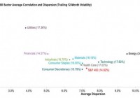
By Craig Lazzara, Global Head of Index Investment Strategy If we needed a reminder of the continuing volatility of the world’s financial markets, the first weeks of 2016 obliged us by providing one. What’s often overlooked, especially when volatility spikes, is that there are two distinct sources of volatility . Understanding them can not only enhance our appreciation of market dynamics, but also provides some important insights for portfolio managers. The two components are correlation and dispersion . Correlation, the more familiar of the two, is a measure of timing . Correlations within an equity market are, in our experience, invariably positive , indicating that stocks tend to move up and down together. As correlations rise and diversification effects diminish, the co-movement of index components is heightened, and market volatility increases. Dispersion, on the other hand, is a measure of magnitude : it tells us by how much the return of the average stock differs from the market average. In a high dispersion environment, the gap between the market’s winners and losers is relatively large. Given positive correlations, as dispersion rises, the market’s gyrations will take place within wider bands – and volatility will increase. The chart below illustrates the cross-sectional interaction of dispersion, correlation, and volatility using the sectors of the S&P 400 . The numbers in parentheses show the last 12 months’ volatility for each sector. Energy, unsurprisingly, was the most volatile sector, driven largely by its very wide dispersion. The Financials sector was the index’s least volatile. Notice that the volatility of Utilities (17.4%) and Health Care (17.0%) were more or less the same. Yet their volatility came from different sources . Utility volatility is correlation-driven; the gap between the sector’s winners and losers is low, producing low dispersion, but the winners and losers are highly likely to move together, producing high correlation. Health Care’s volatility comes from the opposite direction – from low correlation, meaning that the sector’s components tend to move more independently, but with higher dispersion, indicating a bigger gap between winners and losers. The sources of sector volatility have important implications for active managers: For a sector like Utilities, stock selection should be a relatively low priority. Low dispersion means that the gap between winners and losers is relatively low; this reduces the value of an analyst’s skill . For Health Care (and other high-dispersion sectors), the situation is different – the opportunity to add (or to lose) value by stock selection is relatively large. If research resources are constrained, this is where they should be concentrated. The nature of the research question is fundamentally different for these two sector types. For Utilities, the sector call is important, the stock selection decision much less so. For Health Care, the stock selection decision is more critical. An investor who understands the sources of volatility is more likely to be successful at managing and exploiting it. Disclosure: © S&P Dow Jones Indices LLC 2015. Indexology® is a trademark of S&P Dow Jones Indices LLC (SPDJI). S&P® is a trademark of Standard & Poor’s Financial Services LLC and Dow Jones® is a trademark of Dow Jones Trademark Holdings LLC, and those marks have been licensed to S&P DJI. This material is reproduced with the prior written consent of S&P DJI. For more information on S&P DJI and to see our full disclaimer, visit www.spdji.com/terms-of-use .