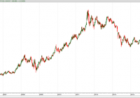
Summary Bullion funds have offered better risk-adjusted returns than mining stock funds and bullion has also been less volatile. Silver has been significantly more volatile than gold in both bull and bear markets. ETFs have generally provided better risk-adjusted performance than CEFs. Precious metal funds have provided excellent diversification for an equity portfolio that mimics the S&P 500. I am primarily an income investor but I have a contrarian streak and believe in the wisdom of Warren Buffett when he opined: “Be greedy when others are fearful.” In a previous article , I applied this advice to energy funds but it is also true for gold and precious metal funds. Gold has been in a sustained bear market since 2011 and prices have plummeted from over $1900 an ounce to less than $1100 an ounce. This has driven down precious metal funds to what I consider bargain basement levels. The rapid fall of gold is illustrated in Figure 1, which plots the price of the SPDR Gold Trust ETF (NYSEARCA: GLD ) . This fund was launched in 2004 and is the oldest and one of the most liquid precious metal ETFs (average volume over 6 million shares per day). One share represents a tenth of an ounce of gold. The gold backing this ETF is held in vaults in London. Gains from this ETF are taxed like you owned the physical gold directly (taxed at collectibles rate if you hold for more than a year). It has an expense ratio of 0.4% and does not provide any yield. The plot shows that GLD has fallen over 37% since peaking in September, 2011. (click to enlarge) Figure 1: Plot of GLD since 2007 I am not clairvoyant and have no idea how long it will take the precious metal sector to recover. However, I am confident that over the long run, gold will again return to its glory days. This is based on past history coupled with the likely fall of fiat currencies due to rampant deficit spending. So personally, I have begun accumulating beaten-down precious metal funds. This article will analyze the risk versus reward of these funds to answer several questions: Is it better to invest in bullion or mining stocks? Is it better to invest in ETFs or Closed End Funds ? Is it better to invest in gold or silver? Do precious metals offer diversification for an equity portfolio? There are many ways to define “better”. Some investors may use total return as a metric, but as a retiree, risk in as important to me as return. Therefore, I define “better” as the fund that provides the most reward for a given level of risk and I measure risk by the volatility. Please note that I am not advocating that this is the way everyone should define “better”. I am just saying that this is the definition that works for me. There are a number of ETFs and CEFs that focus on gold and silver. For this analysis, I chose representatives that have at least a history that includes October, 2007 (the start of the equity bear market) and were reasonably liquid. These selections are summarized below. Exchange Traded Funds GLD. This ETF has already been described. Note that the iShares Gold Trust ETF (NYSEARCA: IAU ) and the PowerShares DB Gold ETF (NYSEARCA: DGL ) are highly correlated (over 99%) with GLD and will not be included in the analysis. iShares Silver Trust ETF (NYSEARCA: SLV ). One share of this ETF tracks the price of one ounce of silver bullion. The shares are backed by silver held in banks in London and New York. Silver is more volatile than gold, primarily because it is sensitive to industrial demand in addition to being a “safe haven” asset. This is not all bad since the industrial uses may serve to support prices if the desire for silver wanes among investors. This fund is very liquid (average 7 million shares per day) and has an expense ratio of 0.5%. It does not have any yield. Like GLD, gains from SLV are taxed as collectibles. PowerShares DB Precious Metals ETF (NYSEARCA: DBP ). Rather than holding physical bullion, this ETF is rule based and invests in both gold (80%) and silver (20%) future contracts. With the focus on gold, it is highly correlated (97%) with GLD. The fund has an expense ratio of 0.75% and does not have any yield. Market Vectors Gold Miners ETF (NYSEARCA: GDX ). This ETF holds 43 cap-weighted precious metal mining companies (mostly gold miners but a few silver miners). About 56% of the assets are Canadian companies with the rest primarily in the U.S., South Africa, and Australia. It is extremely liquid (over 45 million shares per day) and has a reasonable expense ratio of 0.53%. It has a small yield of 0.9%. Closed End Funds Central Gold Trust (NYSEMKT: GTU ). This CEF seeks to replicate the performance of gold bullion. It holds gold bullion at the Canadian Imperial Bank of Commerce and does not lease out gold. One of the main differences between GTU and GLD is that GTU is a CEF that can sell at a premium or discount. Currently, this fund is selling at a 6 discount! During past bull markets, this fund has sold for a 10% premium so the price of the fund fluctuates more than GLD, but there also is the potential of higher returns. This fund does not use leverage and has an expense ratio of 0.4%. It does not pay any distribution. Central Fund of Canada (NYSEMKT: CEF ). This is a closed-end fund that holds roughly 50% gold bullion and 50% silver bullion. As a closed-end fund, it can sell at a premium or discount to Net Asset Value (NAV). During the heyday of the precious metal frenzy, the fund sold at a 15% premium. It currently sells at a 10.9% discount, which is historically low. Over the past 5 years, the average discount has been only 0.6%. This fund does not use leverage and has a low expense ratio of 0.3%. It is relatively liquid for a closed-end fund, trading about 700,000 shares per day. For tax purposes, this fund is a passive foreign investment company so you should consult your tax advisor relative to the treatment of gains and losses. Note that the symbol for this fund is the same as the abbreviation used to indicate closed-end funds, but the context should make the meaning clear. ASA Gold and Precious Metal (NYSE: ASA ). This CEF sells at a 1.4% discount, which is lower than the 5 year average discount of 7.6%. The portfolio consists of 40 miners, with 47% from Canada, 20% from the United States, 10% from the Channel Islands, and 9% from South Africa. About 77% of the portfolio are mining companies with the rest royalty and development companies. The fund does not use leverage and has an expense ratio of 0.8%. The distribution is 0.5%. GAMCO Global Gold, Natural Resources and Income Trust (NYSEMKT: GGN ). This is a closed-end fund that writes options on gold and natural resources stocks. It uses a small amount of leverage (10%) and has an expense ratio of 1.3%. However, it currently is distributing a huge 15.1%, but most has come from return of capital (ROC). The Undistributed Net Investment Income (UNII) is near zero, which is not bad. It is selling at a 14.3% discount, which is unusual since over the past 5 years it has sold at an average premium of 0.8%. It has 112 holdings, primarily precious metal companies, but some oil and other resource stocks. Essentially all of the holdings are from North American firms. To analyze risks and return associated with these funds, I used a look-back period form October 12, 2007 (the stock market high before the 2008 bear market) to the August 12, 2015. This provides a view of how these funds fared over the bear-bull cycle of the stock market. The results are shown in Figure 2, which provides the rate of return in excess of the risk free rate of return (called Excess Mu on the charts) plotted against the historical volatility. The risk-free rate was assumed to be 1%. (click to enlarge) Figure 2. Risk versus reward since October, 2007 As is evident from the figure, there was a relatively large range of returns and volatilities. For example, SLV had a high rate of return but also had high volatility. Was the increased return worth the increased volatility? To answer this question, I calculated the Sharpe Ratio. The Sharpe Ratio is a metric developed by Nobel laureate William Sharpe that measures risk-adjusted performance. It is calculated as the ratio of the excess return over the volatility. This reward-to-risk ratio (assuming that risk is measured by volatility) is a good way to compare peers to assess if higher returns are due to superior investment performance or from taking additional risk. In Figure 2, I plotted a red line that represents the Sharpe Ratio associated with GLD. If an asset is above the line, it has a higher Sharpe Ratio than GLD. Conversely, if an asset is below the line, the reward-to-risk is worse than GLD. Some interesting observations are evident from the figure. Bullion funds easily outperformed mining stock funds. The mining stock funds had negative returns over the observation period and were also very volatile. Not a good combination. Gold bullion had the lowest volatility. The combination of relatively good return and low volatility resulted in GLD having the best risk-adjusted performance. GTU had higher volatility than GLD but also higher absolute return. As previously discussed, this is likely due to the nature of closed-end funds. However, on a risk-adjusted basis, the performance of GTU slightly lagged GLD. SLV was significantly more volatile than gold funds and the volatility was not offset by higher return. Hence, the risk-adjusted performance of silver lagged gold. Generally, CEFs were more volatile than ETFs. One of the worst performers was ASA. It had a negative return coupled with a relatively high volatility. One of the reasons many pundits recommend that people allocate a portion of their portfolio to precious metal is because they are a “diversifier”. To be “diversified,” you want to choose assets such that when some assets are down, others are up. In mathematical terms, you want to select assets that are uncorrelated (or at least not highly correlated) with each other. To check out if these funds do, in fact, provide diversification, I calculated the correlation matrix. I also included the SPDR S&P 500 Trust ETF (NYSEARCA: SPY ) for reference. The results are shown in Figure 3 for over the past 3 years. As you would expect, the funds are moderately to highly correlated with one another but were virtually uncorrelated with SPY. So if you have an equity portfolio that mimics the S&P 500, using precious metal funds does provide excellent diversification. (click to enlarge) Figure 3. Correlation matrix since October, 2007. Figure 2 showed how these funds have performed in the past. However, the real question is how they will perform in the future when the bull market in precious metal returns. Of course, no one knows what will happen but we can obtain some insight by looking at the most recent bull market period from October, 2007 to September 2011. As shown in Figure 1, this was a great period for gold. Figure 4 plots the risk versus reward for the funds over this bull market time frame. (click to enlarge) Figure 4. Risk versus reward during a bull market This plot shows: Bullion funds performed much better than the mining stock funds in both absolute and risk-adjusted return. This was surprising since mining stocks are often touted as being the best investment during a bull market. GLD continued to be the best performer on a risk-adjusted basis. It also had the lowest volatility. SLV excelled on absolute basis but also had higher volatility than GLD. Thus, silver lagged on a risk-adjusted basis. For the mining stocks, GDX outperformed both ASA and GGN. GBP and GTU booked performance that was close to GLD. The last year of the gold bull market had some spectacular gains and enticed fund companies to launch several new precious metal funds. Some of the new ETFs that were launched between 2009 and 2010 are summarized below. ETFS Physical Platinum Shares ETF (NYSEARCA: PPLT ). Platinum is used primarily in industrial applications and jewelry, rather than being held as a hedge against fiat currency. It is rarer than gold and the price is usually, but not always, higher than gold. A primary use of platinum is in automobile catalytic converters, but it also has a wide demand in jewelry, especially when the price falls below gold. One share of PPLT represents about a tenth of an ounce of platinum. It is not nearly as liquid as other precious metal ETFs (trading only about 35,000 shares per day). The ETF holds bullion in banks in London and Zurich. Like the other precious metal ETFs, gains are taxed as collectibles. The fund has an expense ratio of 0.60%. ETFS Physical Palladium Shares ETF (NYSEARCA: PALL ). Palladium is a lesser known precious metal that can be used instead of platinum in catalytic converters and in jewelry. It has many of the same properties as other precious metals in that it is malleable, easy to polish and remains tarnish free. In Europe, 15% palladium is typically alloyed with gold to produce “white gold”. Palladium is used primarily for industrial applications and is generally not considered a “safe haven” asset. Each share of PALL represents about a tenth of an ounce of Palladium. The ETF trades an average of 40,000 shares per day so it is relatively liquid. The bullion associated with the ETF is stored in vaults in London and Zurich. The fund has an expense ratio of 0.6%. Like gold and silver, it is taxed like collectibles. Global X Silver Miners ETF (NYSEARCA: SIL ). This ETF holds 25 cap-weighted silver mining companies. Almost 60% of the constituents are based in Canada and the rest are spread primarily among the United States, Europe, and Latin America. It is relatively liquid (trading about 250,000 shares per day) and has an expense ratio of 0.65%. The fund has a small yield of 0.1%. Market Vectors Junior Gold Miners ETF (NYSEARCA: GDXJ ). This ETF focuses on the junior gold and silver miners. The fund holds 63 miners, some of which have not yet begun to generate revenue. The coupling of small-cap with miners creates a very volatile fund that has the potential for large losses as well as large gains. This is a popular ETF, trading over 9 million shares per day on average. The expense ratio is 0.55% and yield 0.9%. The Risk-Reward plot for the last 17 months of the bull market (April, 2010 to September, 2011) is shown in Figure 5. This is a relatively short period of time so caution is advised when drawing longer term conclusions. However, overall this plot is similar to Figure 2 but also provides a relative assessment of the new ETFs. GLD still leads the pack with DBP, GTU, and SLV close behind. PPLT and GGN did not perform well and barely eked out a positive return. For the most part, bullion outperformed the miners but GDXJ generated a good return but also had very high volatility. (click to enlarge) Figure 5. Risk versus reward for last 17 months of bull market Bottom Line From being the darling of the investment world to one of the most hated asset classes, precious metals have come a full circle… There are no guarantees, but based on the amount of money being printed and the trouble spots around the globe, I think investors will migrate back to gold as a safe haven and an (eventual) inflation hedge. Whether or not you have precious metals in your portfolio is a personal decision. However, if you decide to allocate some of your resources to this asset class, then based on past data here are answers to the questions I posed at the beginning of the article. Is it better to invest in bullion or mining stocks? Bullion has consistently outperformed mining stocks. I know that many investors are wary of GLD but it has been a consistent outperformer on a risk-adjusted basis so it is one of my recommendations. Is it better to invest in ETFs or CEFs ? ETFs have outperformed CEFs. However, for gold, GTU has close to the same performance as GLD. If you want to add mining stocks, GDX appears to be the best choice. Is it better to invest in gold or silver? It depends on your risk tolerance and investment objectives. Silver typically has high returns but much higher volatility than gold. On a risk-adjusted basis, gold is the winner. Do precious metals offer diversification for an equity portfolio? Definitely yes. Precious metals are not highly correlated with equities. Even mining stocks offer significant diversification with respect to other types of equities. Disclosure: I am/we are long GTU,GLD,CEF,GDX,GDXJ, SIL. (More…) I wrote this article myself, and it expresses my own opinions. I am not receiving compensation for it (other than from Seeking Alpha). I have no business relationship with any company whose stock is mentioned in this article.